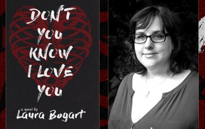
This October, Girls wunderkind Lena Dunham will extend her super influential reach with an essay collection, Not That Kind of Girl. We were intrigued (read: dazzled, revolted) by the astronomical advance she received for the project and now the just-released cover has created even more buzz around the work of the prolific twenty-something.
Anytime a book with even a minor female-power vibe is released, the author/publisher is tasked with creating cover art that’s clever and compelling without being offensive to women or off-putting to a broader audience. It’s a tall order, and some have pulled it off better than others. Here, we rate the covers of some of the most high-profile women-focused tomes of recent years.
Not That Kind of Girl: Dunham’s use of pink and black font is a clever way to play on gendered symobolism, and she wisely lets the jaunty title do the talking. How many months until October again? A
Bossypants: When I first saw this Tina Fey-with-hairy-man-arms book cover, I was thoroughly creeped out. But the more I saw it, the more I liked it. There’s a nice bit of commentary here, on the weirdness of us assuming bossiness/assertiveness is a male trait. The concept witty and subversive, much like Fey herself. B
Lean In: Zzzzz. Oh, sorry. Just fell asleep while looking at the cover of Sharyl Sandberg’s Lean In, which is, essentially…Sheryl Sandberg just sitting there. The book itself is packed with challenging and interesting insights, so why the snoozy, not-at-all original cover? C-
I Shouldn’t be Telling You This: Now this is how you a do a “just sitting there” cover. Here, former Cosmo editor-in-chief Kate White gives her best “yeah I’m awesome” smirk while rocking a fierce skirt in the ultimate power color: red. It’s “I am woman, hear me roar,” where Sandberg’s is “I am woman, hear me purr.” B+
Image: Lena Dunham/Facebook