
Awesome news: Marvel Comics is going to start publishing an all-women Avengers team. The comic will be written by G. Willow Wilson and Marguerite K. Bennett, which is awesome because G. Willow Wilson is awesome (Marguerite Bennett may well be awesome too; I just haven't read her, so I can't personally vouch for the awesomeness). She-Hulk, Medusa, and Dazzler will be among the featured characters—which adds to the awesome because Dazzler is the greatest disco-powered superhero ever, and it's well past time for early-'80s retro superheroes, in my opinion.
Amidst all the disco awesomeness, though, there is one downside.
The cover is . . . not awesome.
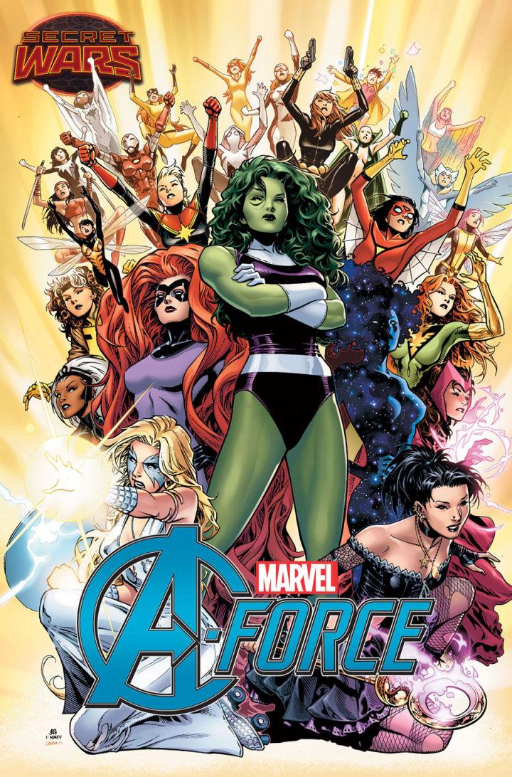
In fact, it is the opposite of awesome. It is clumsy and ugly and ridiculous. Artist Jim Cheung has decided to go with the tried and true, or more accurately, the bland and tired—the first-issue cover trope of having lots of superheroes standing there looking fierce/stern/bored. This is so hoary that it was literally being parodied three decades ago (note Green Lantern's arms crossed like She-Hulk's?).
Worse, Cheung's version of this chestnut is not even minimally competent. Desperate to portray every single female Marvel superhero in a single image, he opts for the least interesting option possible, which is basically just to stack them all on top of each other, creating a kind of writhing multi-limbed spandex lump. Somewhere along the line he realized that characters in the back wouldn't be visible, and so he has them all throwing their arms in the air like a triumphant deodorant ad. Black Widow appears to be squatting on top of She-Hulk's head; Spider-Woman seems to be not waving but drowning; Captain Marvel's arms look like they're trying to pull off of her and fly off into some other cover that does not suck quite so badly. And then there's that logo up front—A-force. I mean . . . A-force? I can't be the only one who sees Dr. Doom and Ultron sniggering evilly together somewhere. "Oh no! It's . . . A-hole force! They'll get us with their superfarts! Hyuk hyuk."
For the most part, I'm sure the cover is just bad because lots of superhero comics are bad. The basic level of craftsmanship at Marvel and DC tends to be shockingly low; incompetent art and barely coherent scripts are more the norm than the exception. A bad cover is no particular surprise when most covers are bad; a stupid team name is part for the course in a genre where "Fantastic Four" and "X-Men" and "The Justice League" are considered examples of brilliant, iconic branding.
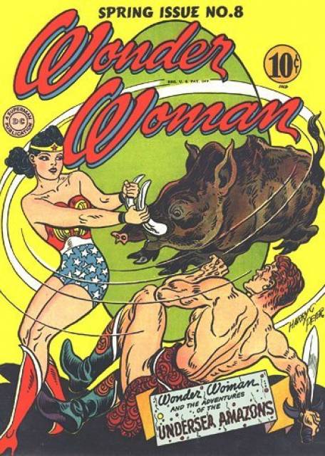
But the particular lousiness of this particular cover also seems like it's a function of discomfort with, or perhaps just confusion about, an all-female superteam. The goal seems to be to represent girl-power—but how do you do that? If you're the wonderful Harry Peter, the original Wonder Woman artist back in the '40s, you might do it by having Wonder Woman hit some over-muscled beefcake guy with a giant wild boar, knocking his sword/phallic symbol right out of his paw:
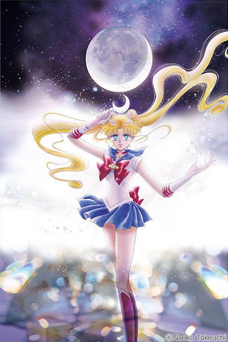
Or there's Sailor Moon by Naoko Takeuchi, where girl power is unapologetically girly, complete with moon, flirty sailor skirt, and background dissolving into a wash of joyful glittery sparkle:
Cheung doesn't want to do femme, and he doesn't want to do playful castration imagery. He can't come up with anything else either, though, so he just settles for girl power as girls standing around in a clump. The whole point of the cover becomes representation; A-Force is exciting not because the women on the cover are doing anything in particular, but just because women showed up. Fans are supposed to be enthused because their favorite heroes are all in one picture together. It's heroism as punching the clock.
It's true that Marvel has not, for most of its history, even managed to punch the clock in terms of providing fans with female heroes. Given that, you can see why Cheung felt that all he needed to do was check the superbox to keep fans happy.
Still, it's a disappointing outcome—and it's made moreso by the fact that the alternate cover by a woman, Stephanie Hans, is definitively better:
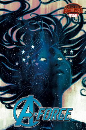
I wouldn't say that this is necessarily a great cover. It's no Wonder Woman swinging a boar, that's for sure, and though it's in the same vein as that Sailor Moon cover, it doesn't really manage Takeuchi's masterfully sugary grace.
Still, Hans conveys a sense of style and mystery. The new superhero here, Singularity, is at once cosmic and innocent. The cover seems to be asking viewers to see themselves as a young girl staring into the universe, and as the universe itself. The semi-transparency of the image blurs watcher and watched; you fall into the image as you'd fall into a new galaxy.
Cheung tries to create something for everyone by jamming his cover full of bodies. Hans is more confident that readers can find the world, and empowerment, in a picture of one supergirl.


